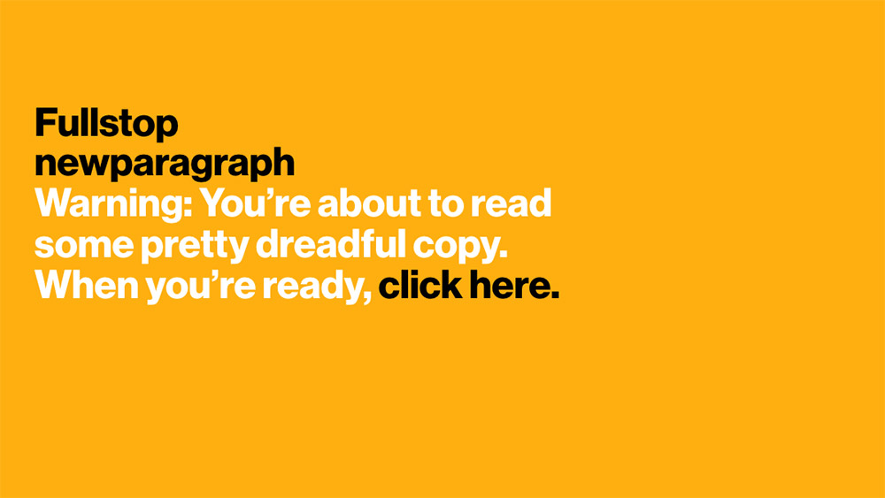
Jon shows you what good copywriting looks like by showing you what bad copywriting looks like first.
A curated list of sites with an extra bit of fun.
Jon shows you what good copywriting looks like by showing you what bad copywriting looks like first.
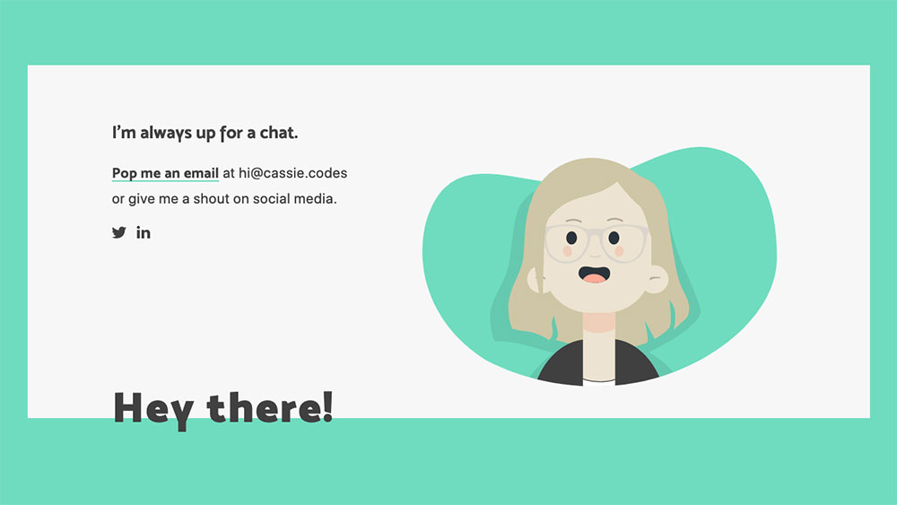
Cassie’s site has lots of fun little details. She even shows up herself to watch you write her an email.
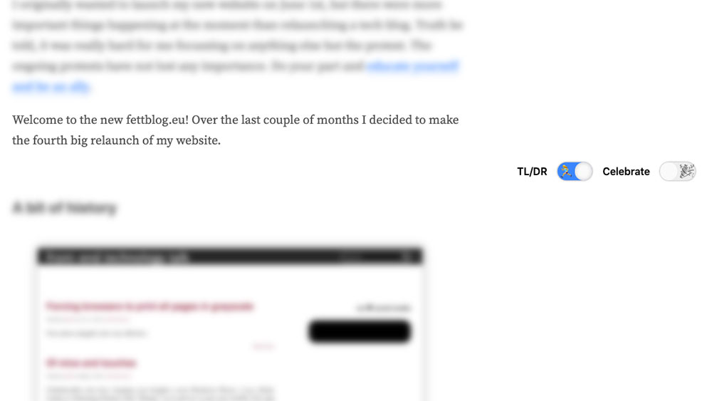
Stefan has a “TL;DR” switch for all his blogposts, showing you just the really essential parts if you’re in a hurry. There’s also a “celebrate” button - I’ll let you figure that one out yourself.
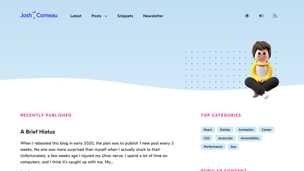
Josh’s site is a regular goldmine of whimsy. Hit counters, heart buttons, sound effects, floating avatars - you name it.
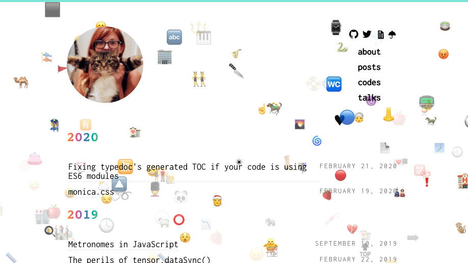
Press a button on Monica’s site and it starts raining emoji.
Swyx’ site is full of web development knowledge, but his scrollbar is full of love.
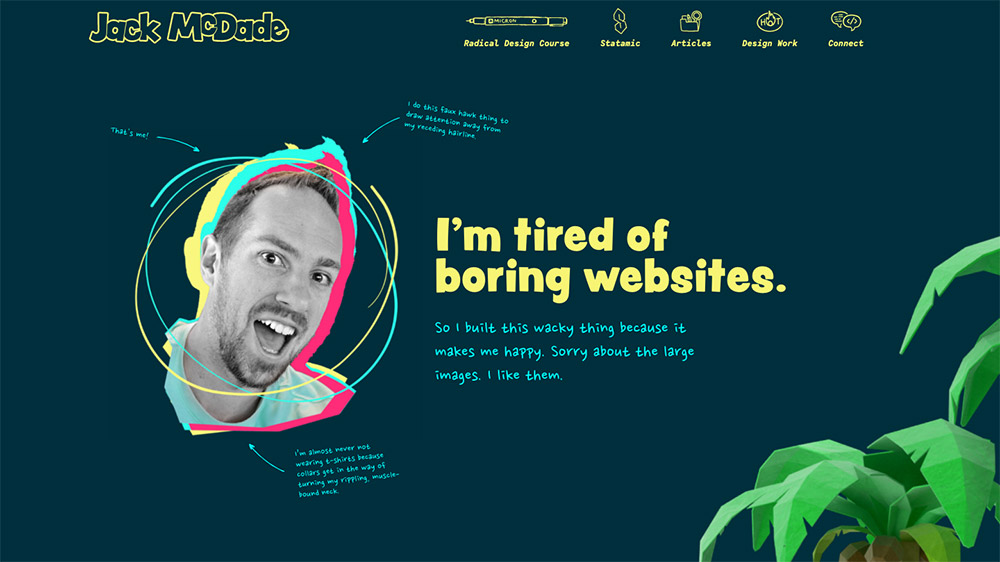
Jack teaches a course called “Radical Design”, so it’s no wonder his site is a bit different. Try scrolling around the “Design Work” section for a good laugh.
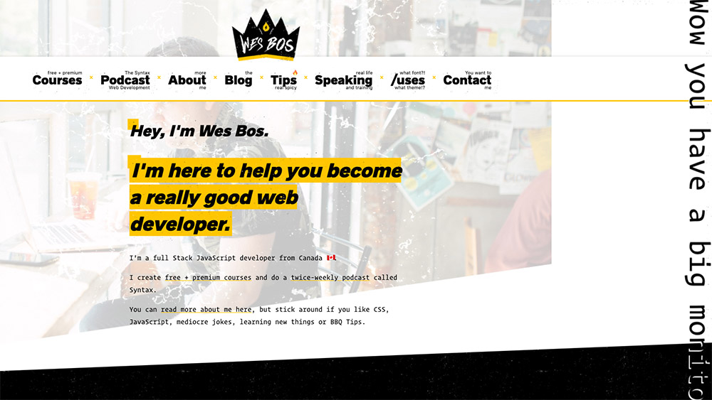
If you view Wes’ site on a very wide display, he congratulates you on your big monitor.
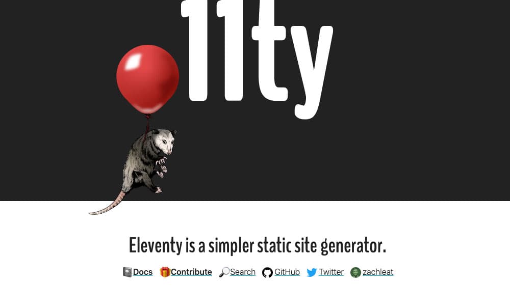
The floating possum is the official mascot of the static site generator Eleventy,
so naturally its documentation includes a nice flyover appearance.
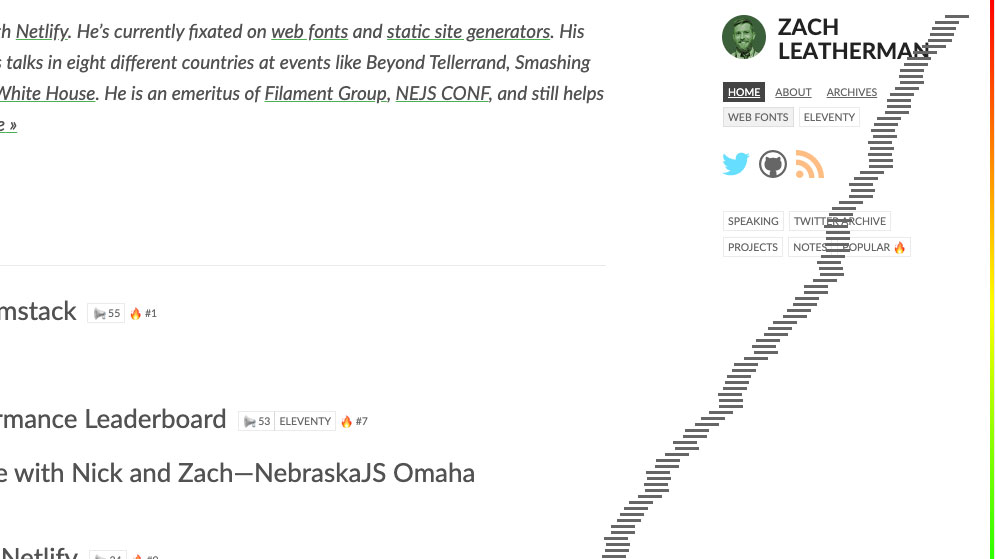
The hamburger on Zach’s site might not be useful for navigation - but it sure is tasty.
That's all of them - for now.
Know a site that should be on this list?